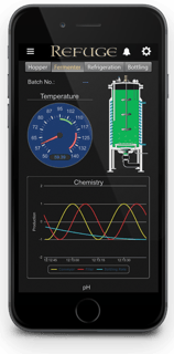
 Want to make your groov operator interface look just the way you want, with your own company logo and colors?
The groov R3.1 release includes new tools to customize pages and gadgets, so you can do that and more.
Add your own logo
Upload your company logo to the new Image Library and display it in the caption bar at the top of every page. The logo can be a maximum of 135 x 35 pixels (if it's larger, it will be automatically resized).
You can also set the logo and caption bar to always remain at the top of the page, even if your user scrolls down.
To set up your logo and caption bar options: in groov Build, choose Configure > Project and look under groov View Styling.
Use your own colors
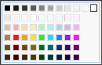
While you're putting your logo in the groov View Styling section, also choose the colors you want for the top caption bar and the gear menu.
 When you create pages, choose page background colors to blend with your caption bar and menu.
If you already have pages and want to change their colors, that's easy to do. In the Pages panel on the left side of the workspace, click the page you want to change. In the Page Properties panel just below, choose the new background color.
Customize text colors and fonts
Now you have much greater control over the fonts, colors, sizes, and position of text on the page.
In the past, all live values shown in a groov interface were bright blue. That's a good way to indicate which values on the page come from sensors and other inputs. But if you wish, you can now change the color of individual live values. Just choose a different color under Value Style in the gadget's properties.
For all gadget text and labels you can now choose different fonts, colors, and sizes. You can also choose to place gadget labels on the left or right. With these new features you can show a bank of small LEDs, for example, or make gadget labels larger or smaller to fit text length or the space available. Just don't make them too small to read!
You can choose to show related elements with similar fonts, or simply change the font as you prefer. Six fonts are available. When choosing colors, remember that some of your users may be colorblind, so don't rely on color alone to indicate status or out-of-range values. When you choose text colors, make sure they provide excellent contrast to the page background.
For more information
For more on customizing your groov interface, see the groov Build and View User's Guide, especially Chapter 4, "Gadget Reference."
With all these new options, you may want to review our white paper on HMI design, Building an HMI that Works: New Best Practices for Operator Interface Design. You'll learn 7 ways to make your HMI more effective for your users and the reasons why they work.
Ready to customize your groov mobile operator interface? Then now's the time to get groov R3.1. Plus you'll get lots more image capabilities, security updates, and additional new features. See the groov Readme to find out everything that's included.
Get the groov R3.1 update
If your maintenance is up to date, you can download groov R3.1 for free and start customizing your mobile interface right away.

