Visual Data Overload
One of my many jobs during those first few weeks at the factory was to review the graphics used on the pilot's touchscreen interface.
Put simply, I was asked by Jim to "fix them."
To be fair, the lead programmer had a LOT on his plate at the time. Each of the 180 or so devices had to be tested and re-tested for its performance and its interaction with the rest of the control network on the submarine... Time to make the display "pretty" was just not something any of the team members had.
(Also keep in mind Jim is a movie director as well as deep sea explorer. The "look" of a control panel is an important aspect in his mind's eye).
Since my role at the start was one of consulting to the lead programmer, I had a little time to spend tweaking the graphics to be as efficient as we could. The other big advantage of me doing this job was the amazing resources of the talented people back at Opto 22.
Over a very memorable lunch (while eating traditional Australian meat pies and drinking iced coffee (both of which are very very rare finds in America!) the life support and sphere internals guy and I roughed out what the pilot needed to see and interact with on the 7-inch touchscreen.
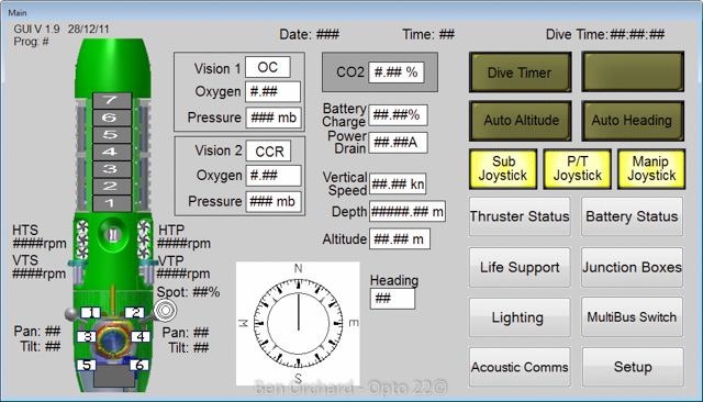
This is how the main screen started out.

There is no question that it's functional.
You can see the life support data (called "Vision") in their boxes. Depth, power, etc. are all there. It's just a bit compressed and rather hard to pull the critical stuff out. For example, take a quick glance at that screen and it's really hard to find what depth you are, or what your altitude off the sea bed is.
In other words, the pilot has to sort the graphical data while he's doing a ton of other things.
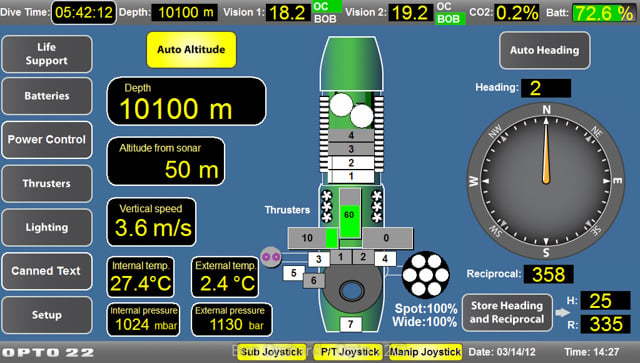
I took this screen as a starting point, talked with both pilots (Ron Allum and Jim), talked to the life support guy (John Garvin) some more, sat in the control room for a few multi-hour simulated dives to observe the pilot's workflow, made a ton of notes, had a lot of Skype sessions with the folks back at Opto, went through countless iterations, and finally came up with this.

Let's take a look at some of the changes.
At the top of the screen is the life support and battery state. This status bar is on every screen. It never moves or changes order. That way, no matter what the pilot is doing, he can always see his life support system status and the battery status, arguably the two most important systems on the sub.
Any out-of-normal values are highlighted in red, so they really stand out. No flashing; that would have gotten old really quick in such a confined space. (Check out the photo of the sub interior in my part 1 blog).
Down the left side of the screen is the menu. Jim is left handed, so we moved the menu to the left edge of the screen so that as he is switching menu options his hand never covers any data on any screen. (Remember, they were using a touchscreen to drive these graphic elements).
Finally, you have the data. Biggest at the top is most important (depth) and it goes down the screen and down in size.
This main screen is featured many times in the movie James Cameron's Deepsea Challenge 3D (You can even see Jim interact with it in the trailer on YouTube). It was front and center for the pilot during every dive.
The sub graphic in the center of the screen gives a good overview of what the settings are outside the pilot sphere. You can see the thruster values and the current light configuration.
The compass rotates around the needle so you are always moving "forward" but in the direction indicated on the outer dial. (In other words, it worked like a traditional compass—no mental gymnastics required to know what direction you are heading).
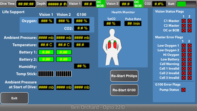
The other screens got a similar makeover. Here is the life support screen.

Just to be clear, Opto did not control the life support. They had their own small computers on each re-breather, but the Opto serial ports picked up the data from those computers once a second. If any parameter was out of range, it would be brought to the pilot's attention.
Of note here is that Jim insisted that there was to be no alarm sound. There was enough going on that he relied on sound to inform him of what the sub was doing and did not want its normal operation muted by an alarm sound.
Some of the screens conveyed a lot of information. There just was no getting around it.

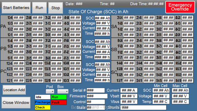
This is the main battery status screen. We needed to see the key data points for every battery at a glance.
(Note, this screen nicely shows the split-sub idea for redundancy. Port and starboard are left and right. A, B, and C are top, middle, and bottom).
What we did in this case for the pilot was to provide an initial summary screen, an overview of this detailed information. If the pilot had the need, he could dive deeper into the graphics via the menu buttons, but most of the time, the main control screens and summary screens were all he used during any of the dives.
These detailed screens got some use during the pre-dive checks and post-dive shutdown procedures, so were not wasted in that regard.
There but not there.
They say the best technology is invisible.
The same thing can be said of user interfaces. When it is so ingrained and intuitive that you don't even notice yourself using it, the graphics are about right.
Given the time and constraints we were all under, I am not sure we got there, but we made a big difference, and I know for a fact that both pilots appreciated the "upgrade" that Team Opto provided.
Note: To check out just how cool the graphics of our PAC Display program can be, take a look at our demo program. You get the graphics, the control program, and the simulator needed to run it on your computer all for free. You can view a video on how to get this free project up and running on your PC over on YouTube.
If you are working on building a graphical UI for a project or machine, check out my hints and tips screen cast.
