 With groov, you can easily build an operator interface that works on any size screen: wide-screen TVs, desktop computers, tablets, and smartphones. Everything automatically scales to fit on any device.
But considering the size and shape of these screens—and how your users will want to use the data on them—you may not want the same things to appear in the same ways on a TV and on a phone.
 Let's take a look at a new way you can customize your operator interface for phones versus larger devices in groov R3.1: by unlocking gadget properties.
Before R3.1, you could rearrange gadgets and text so that the Desktop/tablet view would show them in a horizontal screen, while the Handheld view would show them vertically, which is how you usually look at a phone. You could move the most important gadgets to the top for the phone.
You could also stash any gadgets you didn't need to see in one view or the other. For example, you might include a trend for engineers monitoring the desktop view but leave the trend off for technicians in the field on a phone.
In groov R3.1 you can still do all that, but now you also have almost complete control to customize how gadgets and text look in each view. You can:
- Enter a longer label for a gadget viewed on a desktop, and a shorter label for one viewed on a phone.
- Arrange sliders and indicators horizontally on the desktop and vertically on the phone.
- Show a greater level of precision for values on a desktop.
- Show a shorter field for inputs or values on a phone.
- Make LEDs very small to show a grid of them on a phone.
- Choose a gadget's size in grid units for one view while leaving it automatically sized in the other, or choose different sizes for each.
- Put a gadget label on the left for the desktop and on the right for the phone, or vice versa.
- Change the sizes and colors of text in the two views.
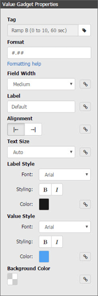
The key to doing all this is a little icon in the gadget's Properties panel: ![]() You can see it several times in the Value Gadget panel at right.
You can see it several times in the Value Gadget panel at right.
This icon appears next to each property you can customize for Desktop/tablet or Handheld views. When the link is solid, the property will be the same for each view.
But if you click the icon so it becomes a broken link: ![]() then you can set the property individually for each view. The ability to break the link and customize your views is a powerful tool to build the operator interface you want.
then you can set the property individually for each view. The ability to break the link and customize your views is a powerful tool to build the operator interface you want.
Put this feature together with the new groov Image Library, customization tools, and all the other new features plus security updates, and you'll definitely want to upgrade to groov R3.1.
Is groov R3.1 free for you?
In groov Build, choose Configure > Licensing. If your maintenance has not yet expired, you can get the free update at manage.groov.com. If your maintenance has expired, go to manage.groov.com to renew it and then get the update.

